
Task
Bridge is an Australian tech start-up focused on building a quoting and invoicing app for tradespeople. The design team had a gap in there skill set and needed someone with UI design experience to refresh the product.
Goal
My goal was to strive for simplicity and implement a design system that would reduce time and effort when creating mock-ups and prototypes. I also wanted to create a library of reusable components that would help speed up development and eliminate the need for complex design notes whenever new features were built.
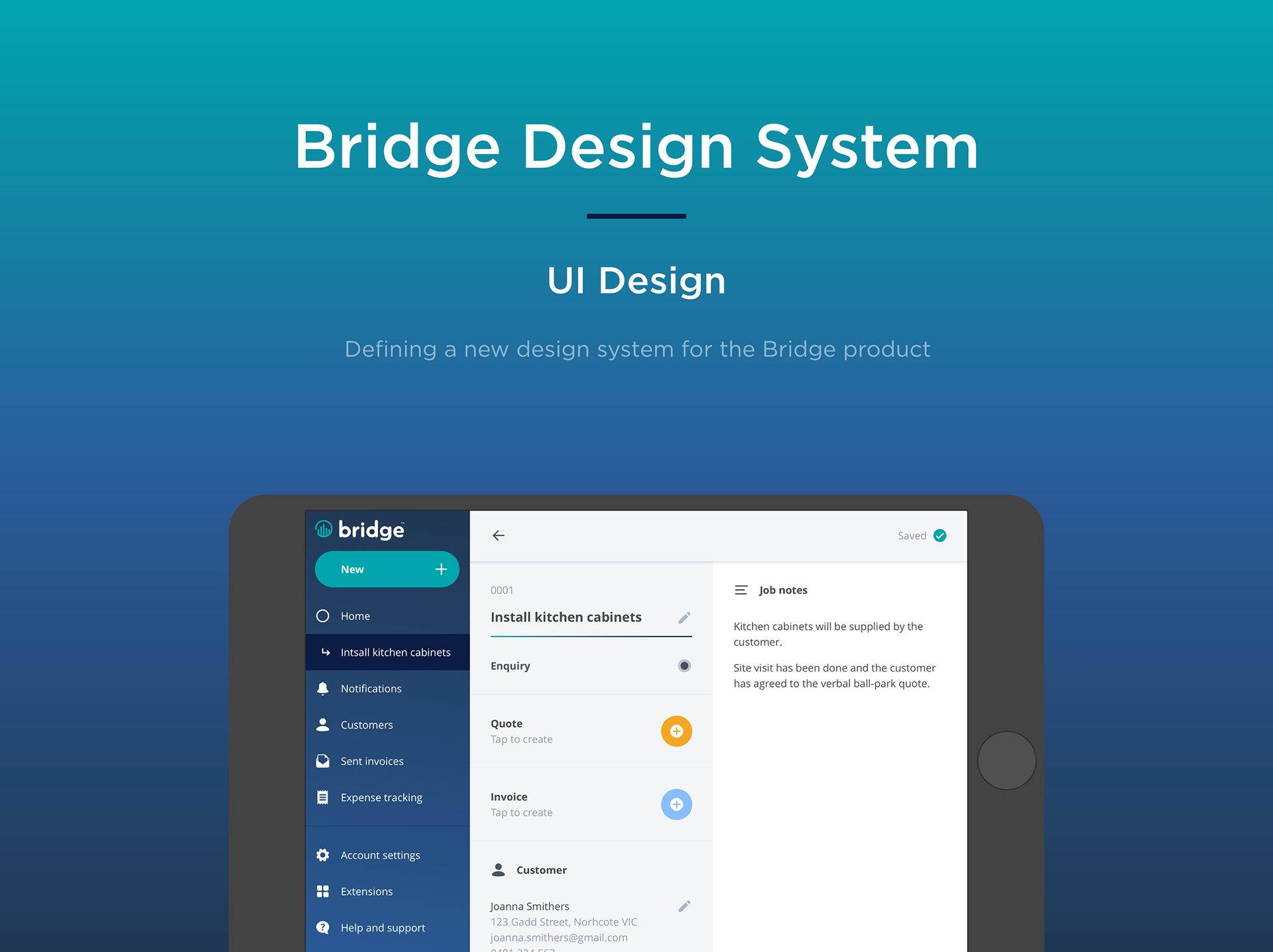
Original UI

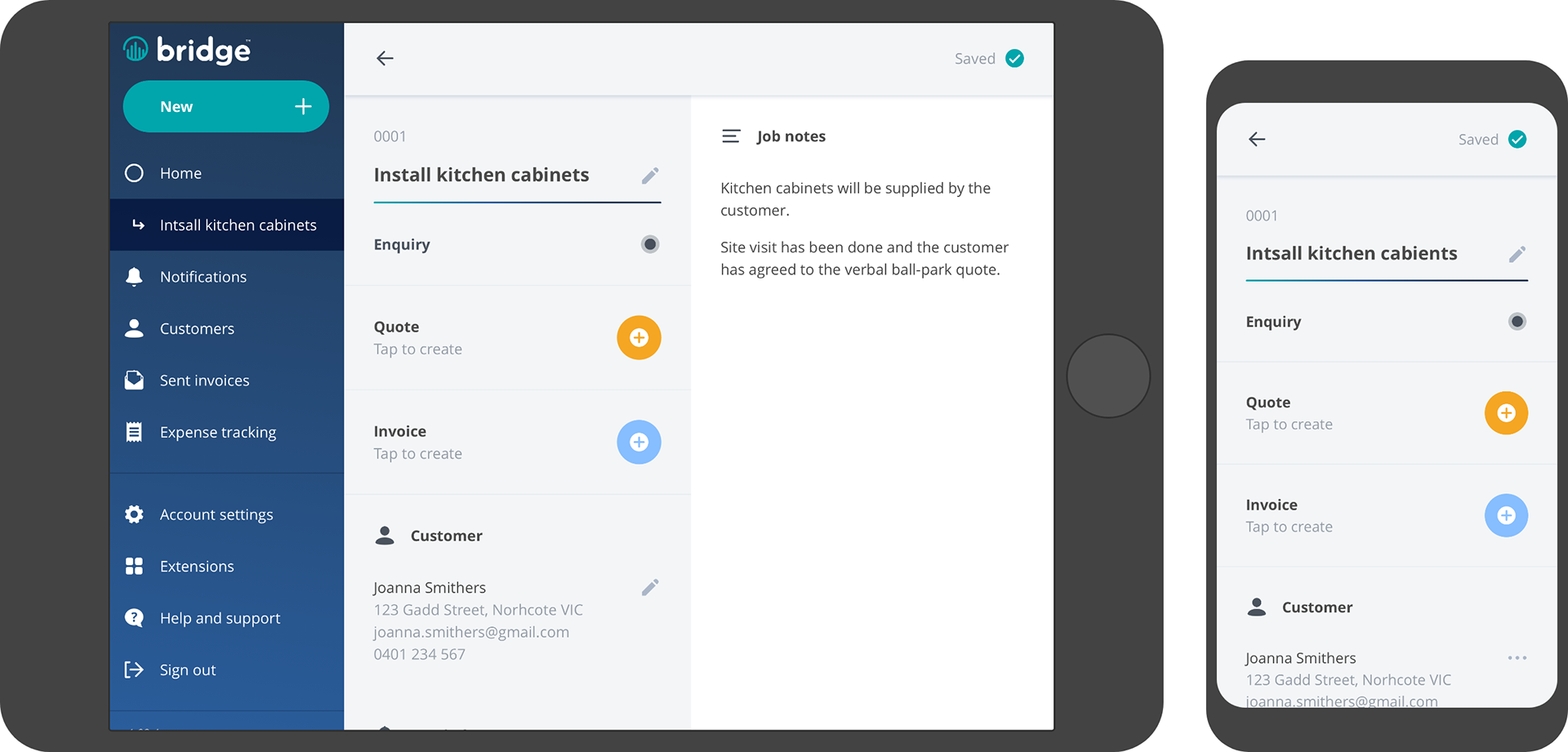
Refreshed UI
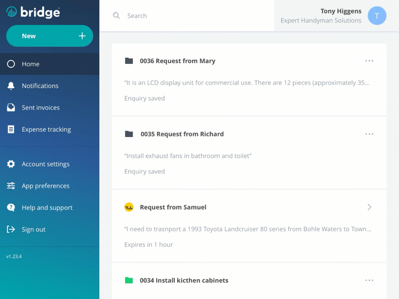
UI using the new design system
Page transition concept created in Principle
Process
I started by reviewing the existing type styles, colours, icons and padding rules across the product. I found that there was an excessive amount of variation in type styles that could easily be simplified. I also felt that the icon set lacked some consistency in style and size. While the variation in padding and consistency across different platforms could also be simplified.
The first thing I did was reduce the number of font sizes to 3 (large, normal and small) and set the line heights to sit on an 8px grid. Then I reduced number of weights to 2 (bold and regular). Next I decided to reduce the number of font colours to 4 main colours (dark, light, error and brand).
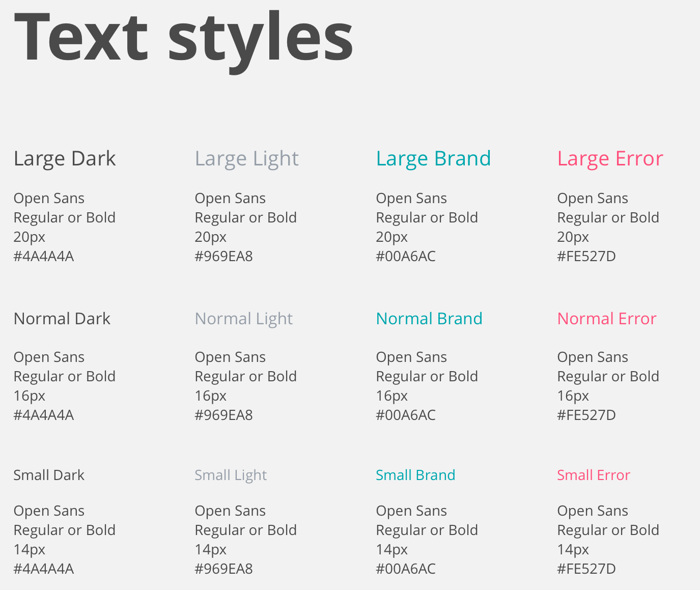
Simplified text styles
During this exercise I noticed that the existing colour palette could be tweaked and made more harmonious.
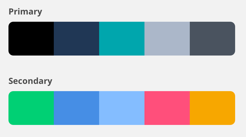
Updated colour palette
As I went through the product, updating the type styles, I began to redesign the icon set. I defined a grid system for the icons to ensure the visual weight would look consistent across the set.
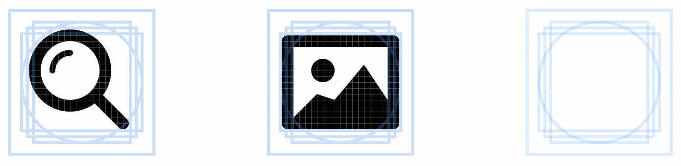
Icon grid
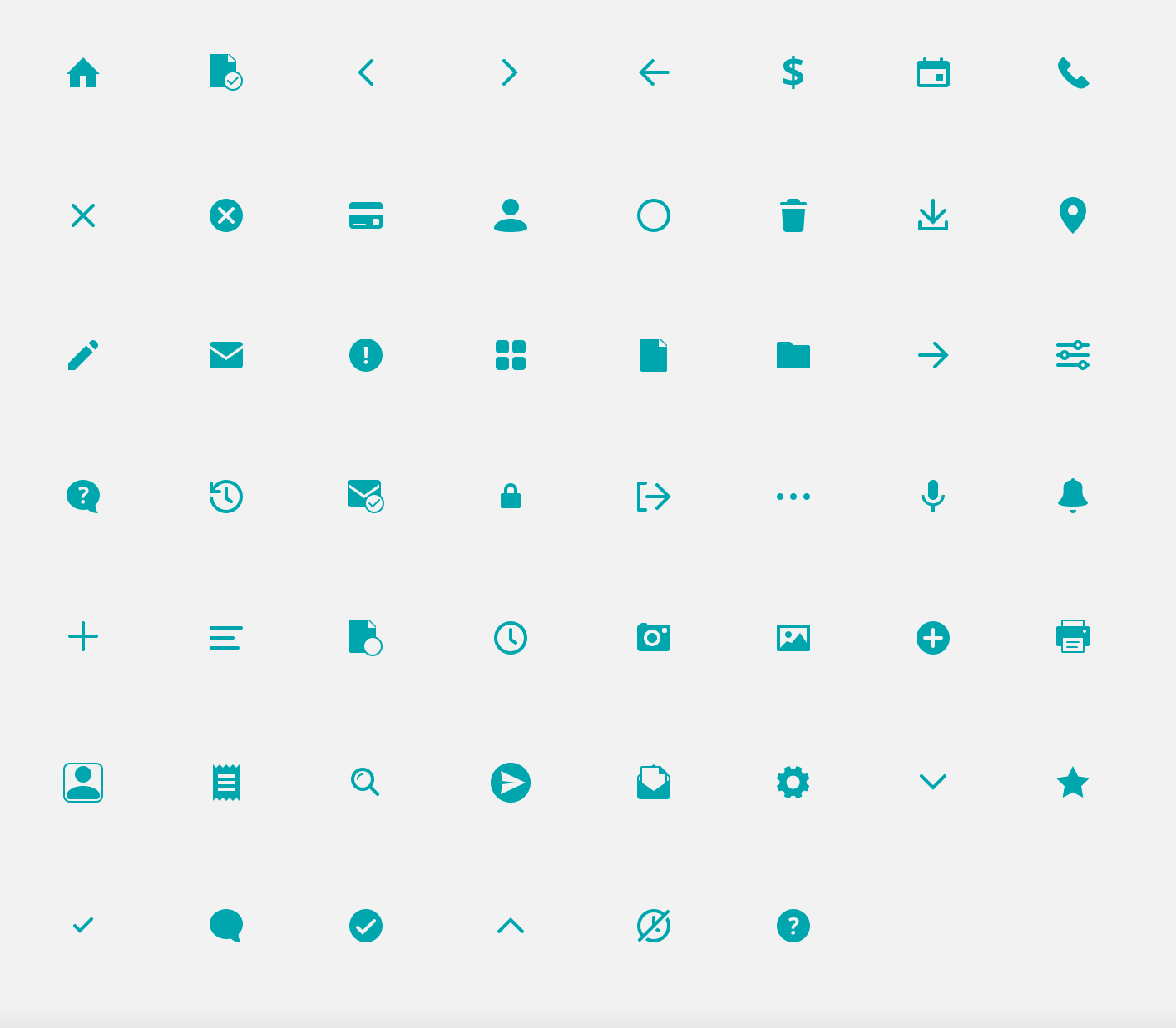
Updated icon set
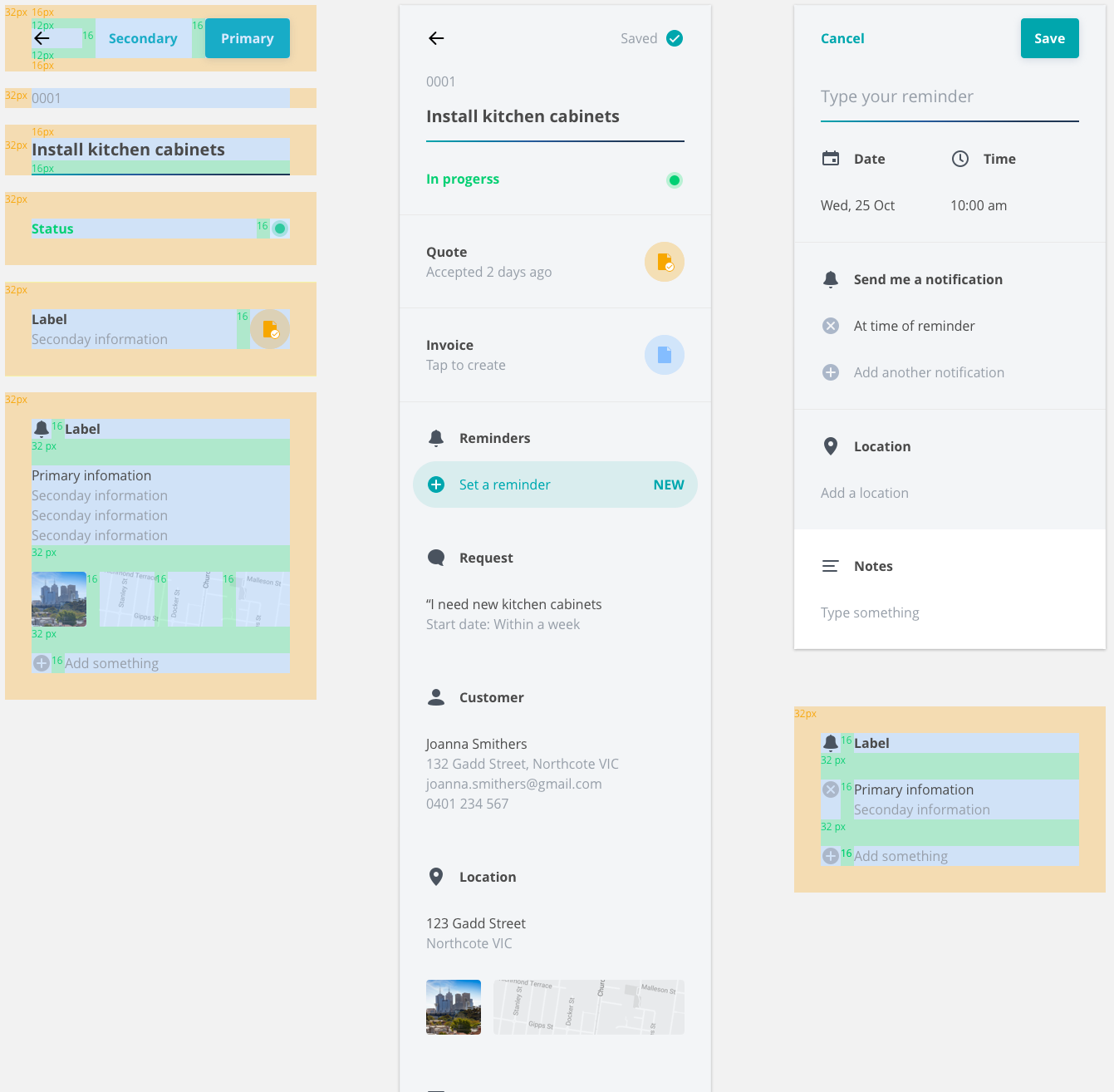
The next step was to reduce the variation in padding. Using the 8 pixel grid I decided that padding should have 3 main values (16px, 32px and 64px). Theses values were named ‘Standard’, ‘Heavy’ and ‘Heaviest’. Of course there were cases where these rules would be broken, but whenever possible components would be designed using only these values.
With all these rules in mind and a fresh icon set and colour pallet I was able to start designing the reusable components. I went through the product and updated all components and began removing any components that I felt were adding to the complexity of the product.
As each component was designed it was added to a Sketch master library and shared with the design team. At the same time I would quickly mock up the specs and share screenshots with the developers. I would then discuss the expected behaviour and instances where certain components would appear.
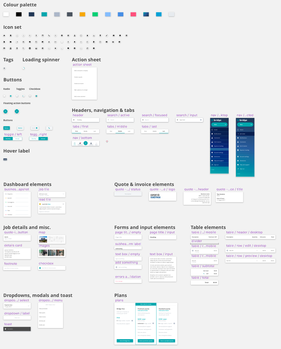
Component library created in Sketch
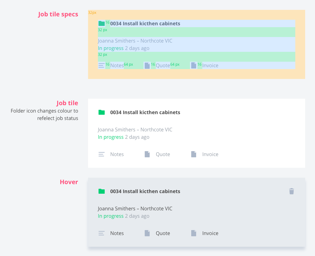
Design documentation for developers
At times the design moved faster than the product. I’d often need to redesign components if the proposed design was slowing down development. But this was rarely a difficult task as the rules I’d defined allowed for flexibility in the design.
Outcome
The new design system and Sketch library allowed us to use the components like lego blocks. Mocking up UIs and creating prototypes became a lot easier. We were able to create highly detailed flows, get feedback faster and easily make changes to the UI.
Using components like lego blocks to create UIs